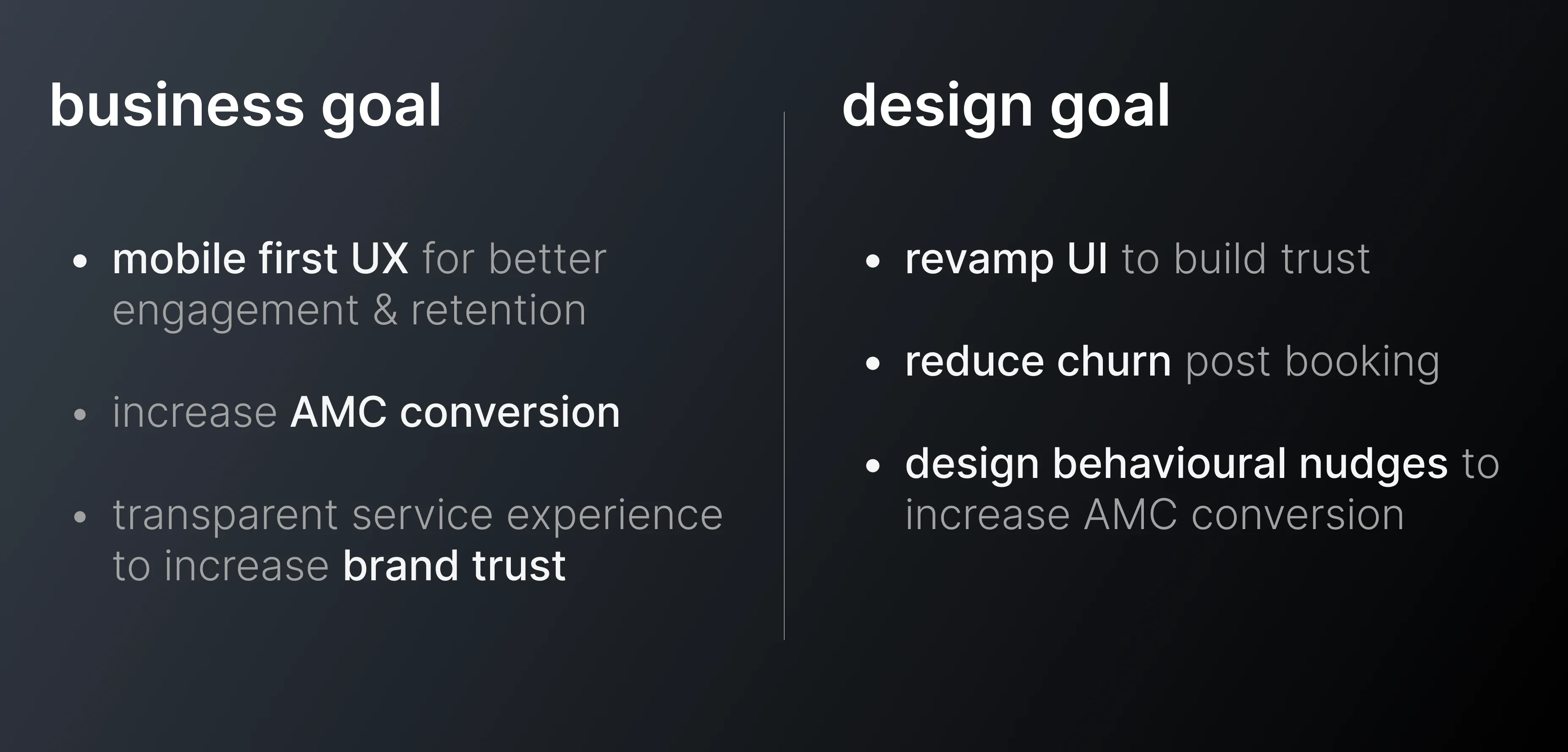
Mobile app design
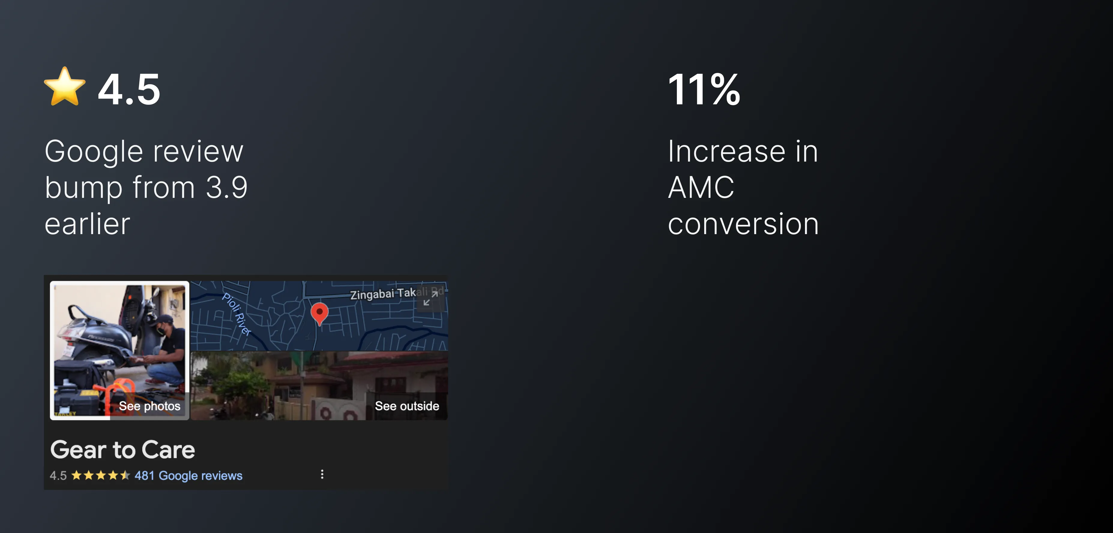
Google rating bump from 3.9
Increase in AMC conversion
overview
Client: GearToCare (G2C)
Role: Lead Product Designer
Timeline: 2.5 months
Platform: Mobile (Android-first MVP)
Team: Founder(marketing background), 1 Designer (me), 2 engineers
GearToCare is a two-wheeler doorstep service startup helping users skip long service center visits. I was brought in to transition their basic website booking flow into a full-feature mobile app, while improving retention and upselling AMC (Annual Maintenance Contracts).
highlights
Use of FOMO to increase AMC (annual maintenance contract) conversion
deliverables
Customer journey mapping
UX research
UI design
Prototyping
goals
discovery & research
Qualitative user interviews
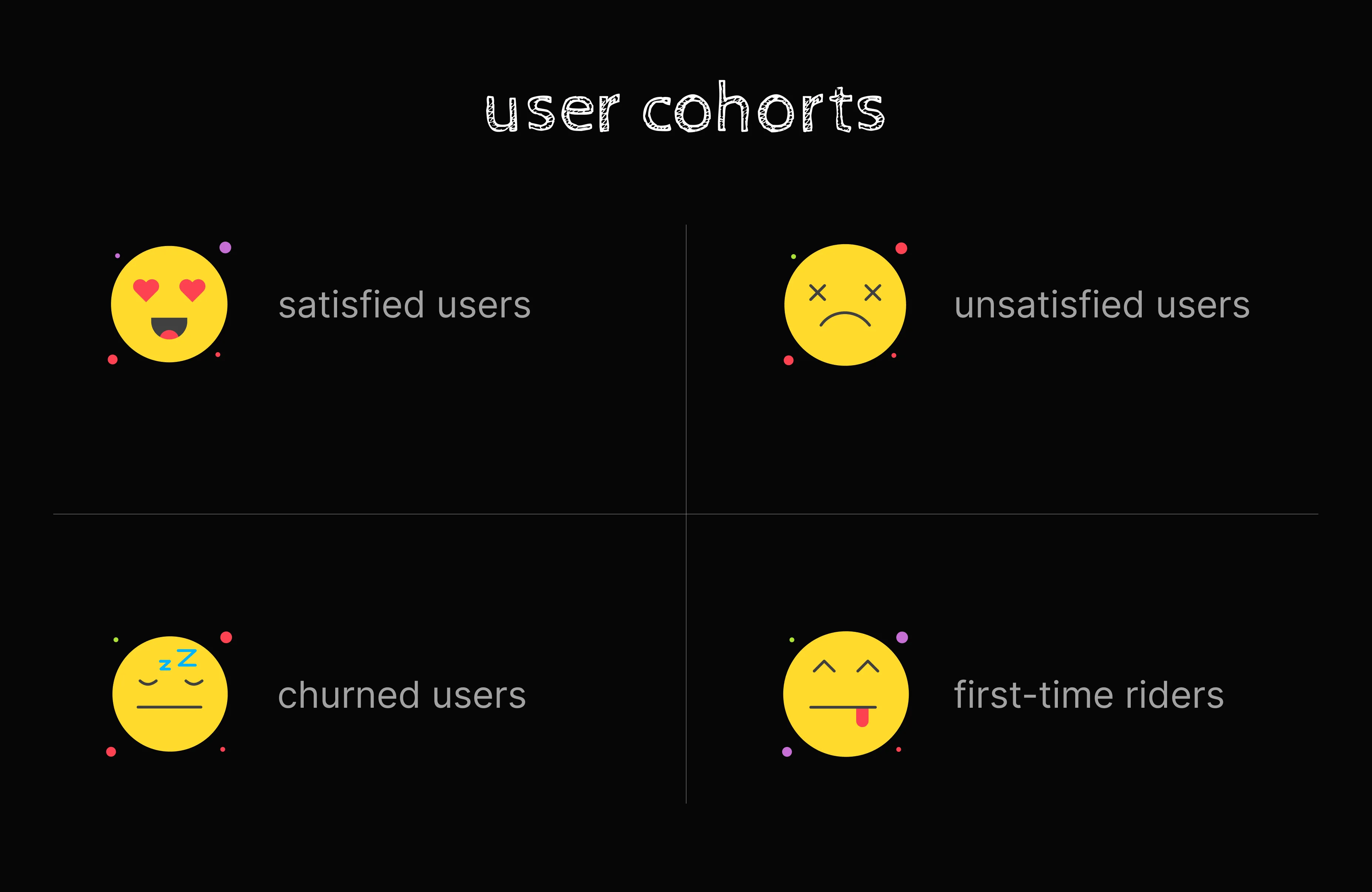
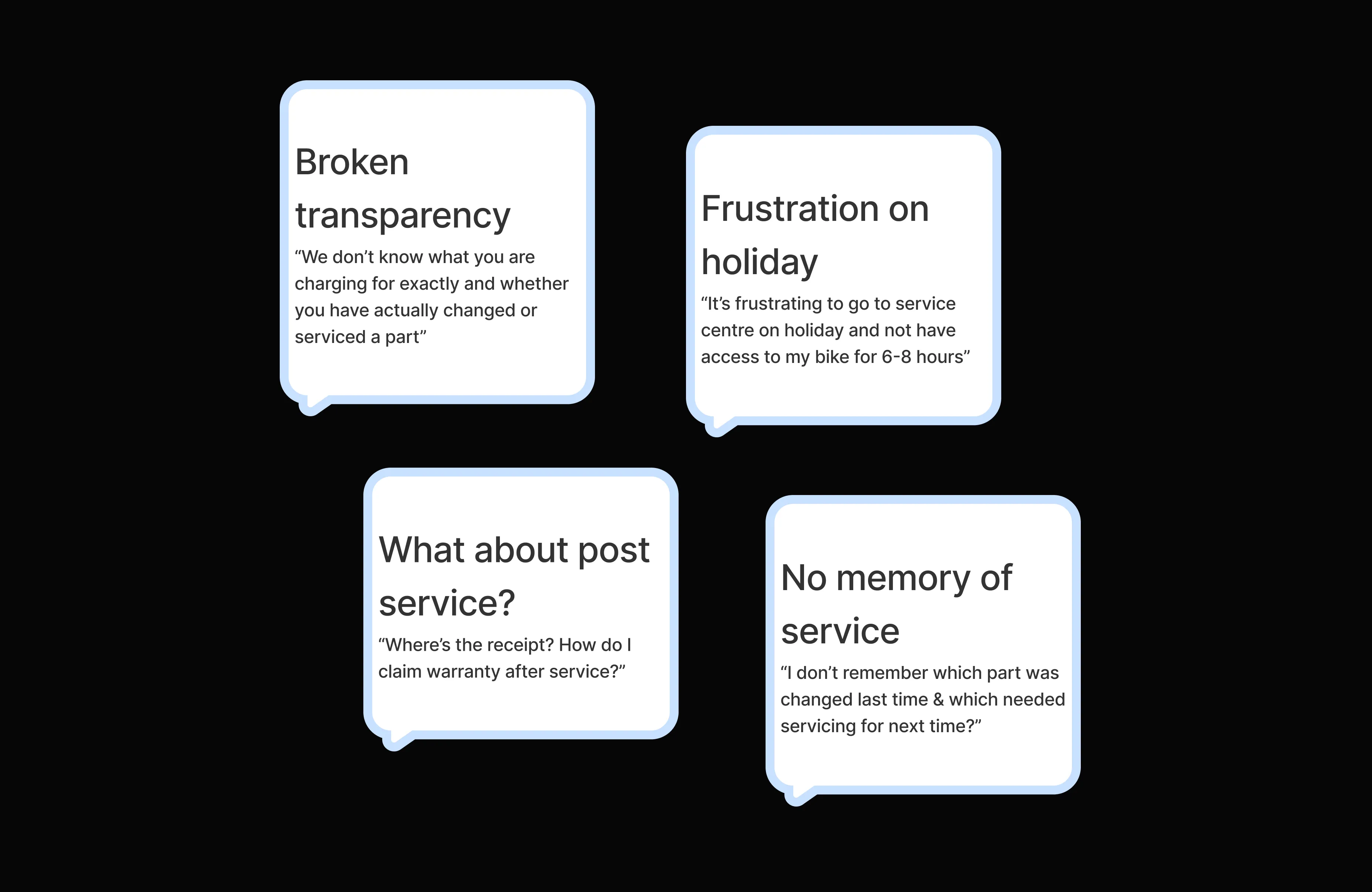
Key Insights
problem framing
How might we bring transparency, convenience, and credibility to the 2-wheeler servicing experience so users feel in control even when they’re not present?
This framing helped us approach trust as the product, not just an outcome.
design process
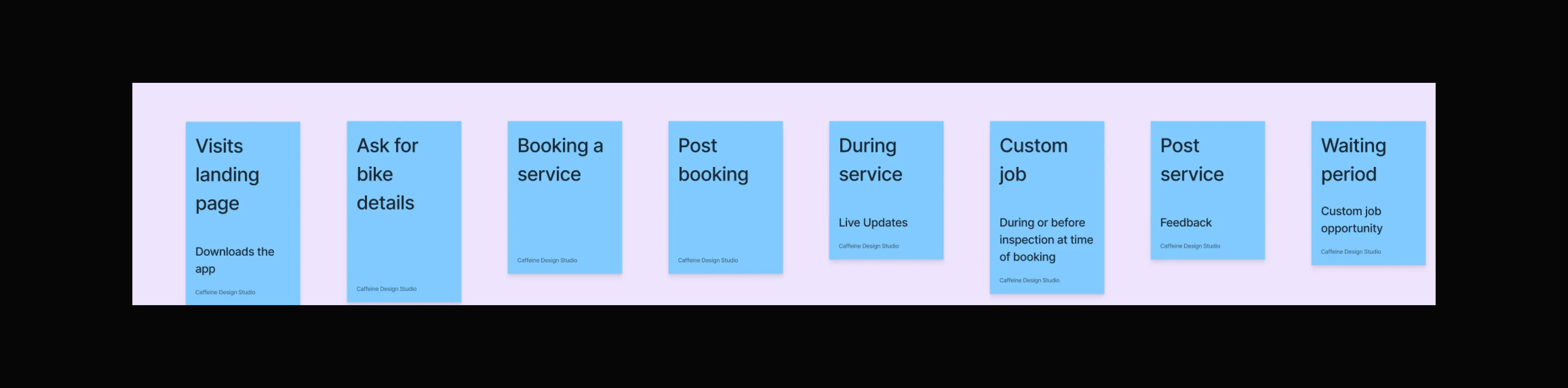
Mapping entire service lifecycle
We started by mapping the entire service lifecycle, from booking to doorstep pickup to delivery, using ride-hailing and food delivery apps as mental models.
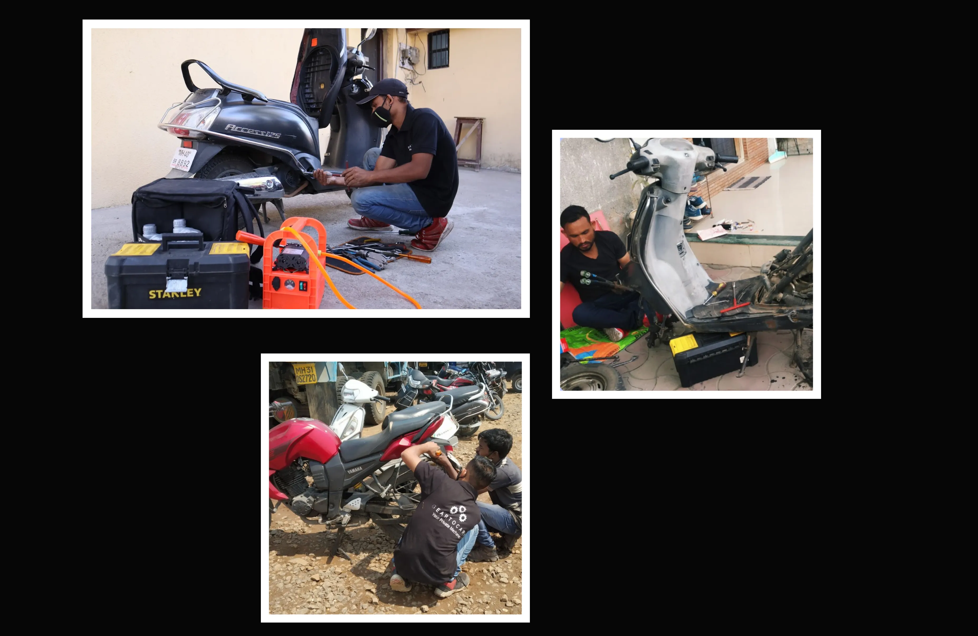
Workflow shadowing
Workflow shadowing the mechanics helped us understand the real world constraints (e.g. limited device access, missed updates due to lack of clarity on using the app).
User interviews
We conducted user interviews around information gap anxiety & trust gaps with 4 different cohorts of users as mentioned above.
User flow, IA, Wireframes
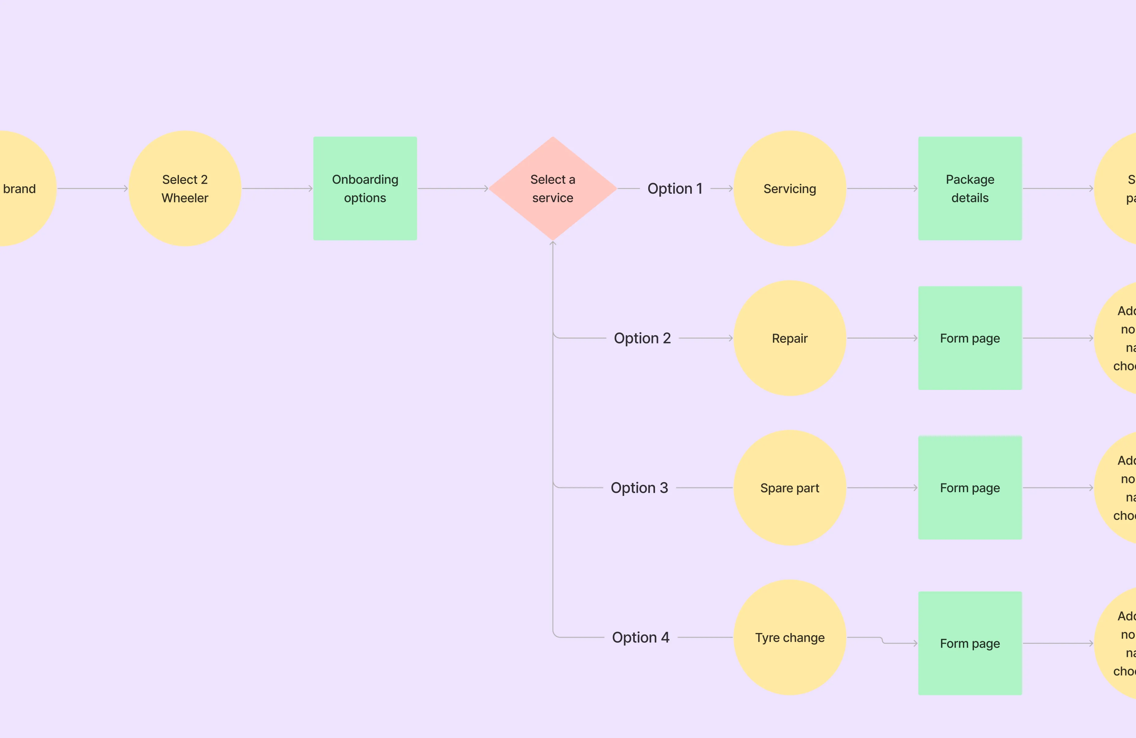
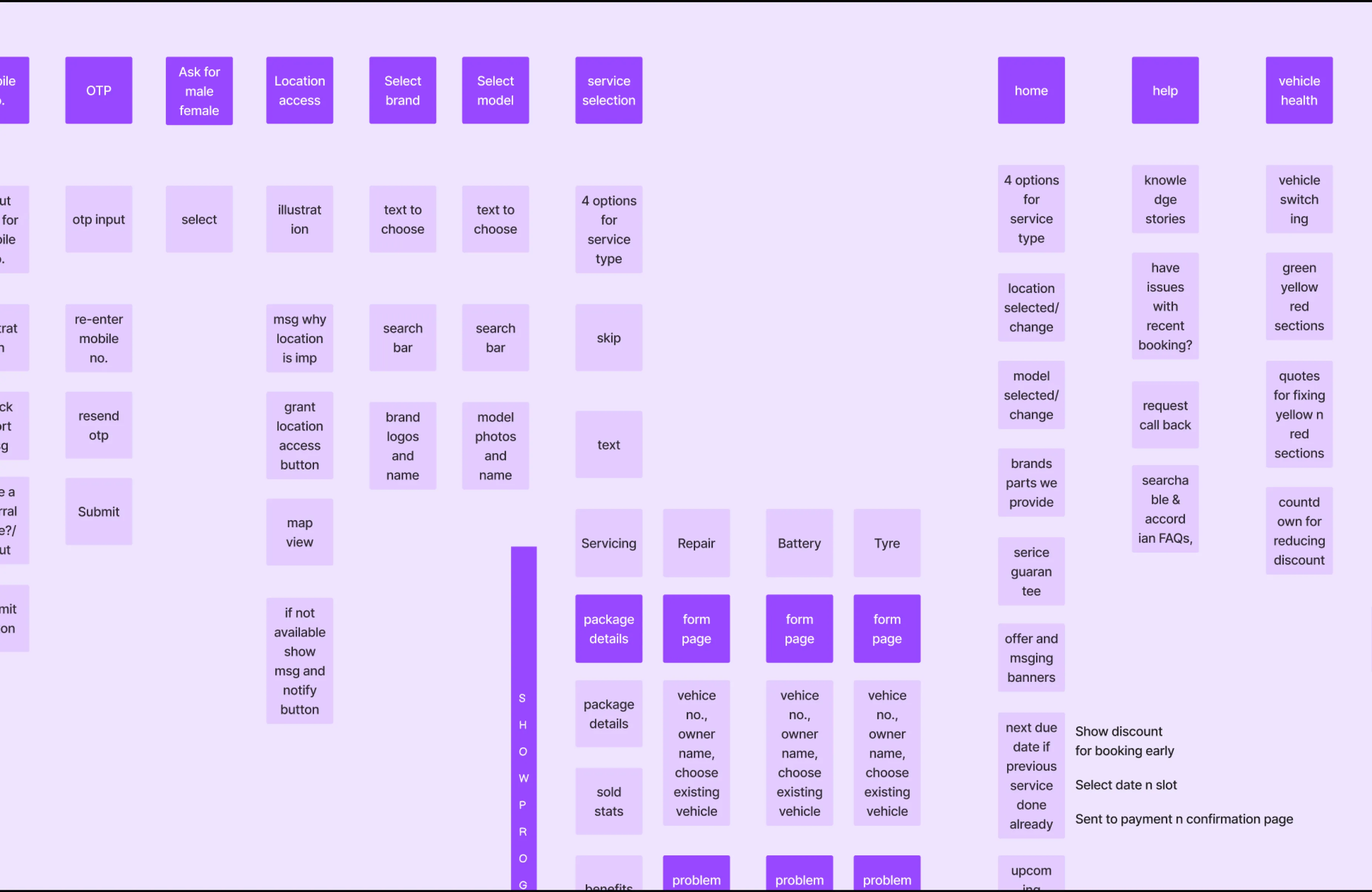
solution
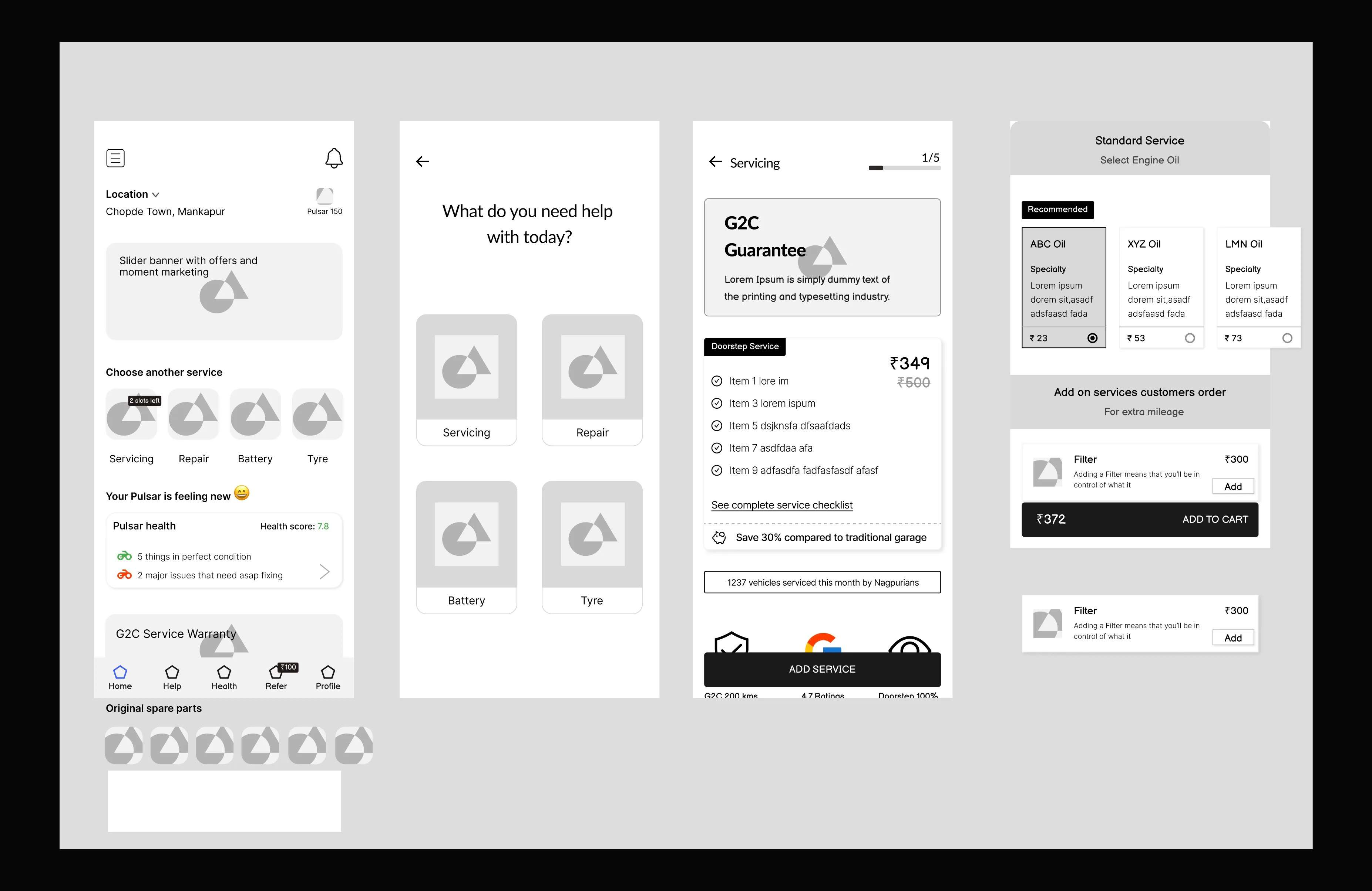
1. Health Card System
Inspired by diagnostic reports, I designed a bike health card with 24 checkpoints categorized into:
✅ Green – All good
⚠️ Yellow – Monitor, fix soon
🔴 Red – Immediate action needed
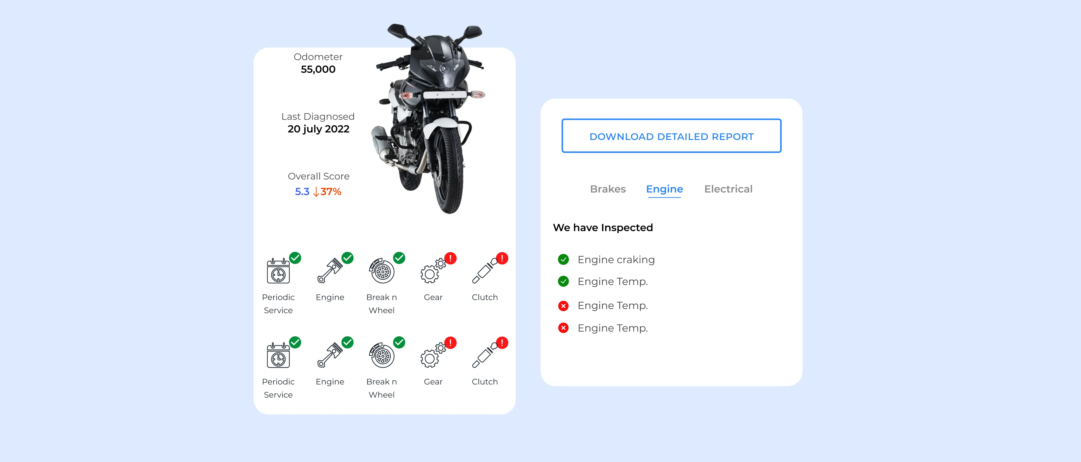
This gave users clear insight into the state of their bike and created natural upsell triggers.
“It’s the first time I knew what actually needed fixing.” - Pilot user
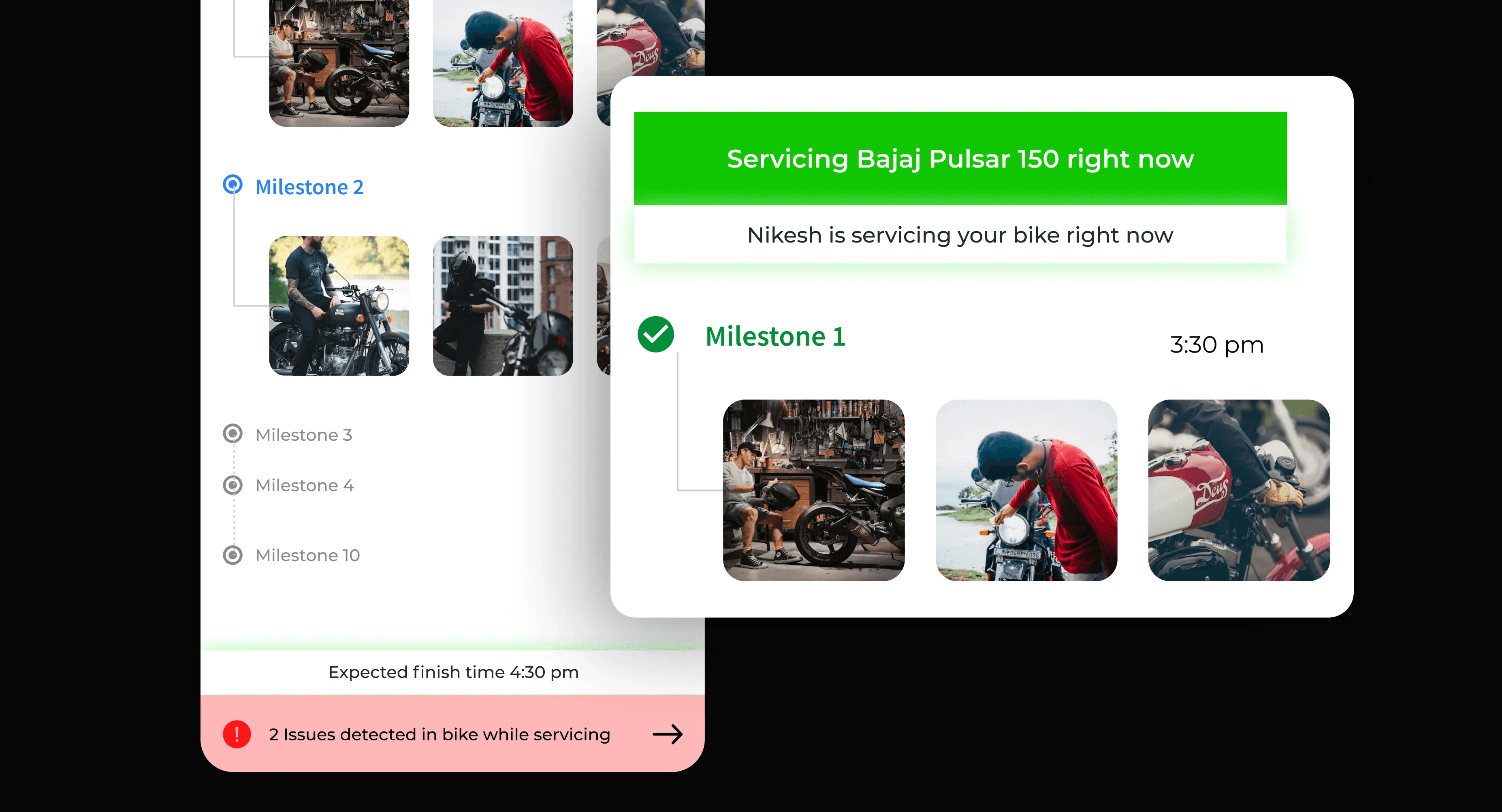
2. Live Servicing Tracker
To reduce trust friction, I introduced a live tracker with status updates, timestamps, and media (photos/videos) uploaded by mechanics. This acted like a food delivery tracker, but for your vehicle.
Users could follow along asynchronously, turning anxiety into assurance.
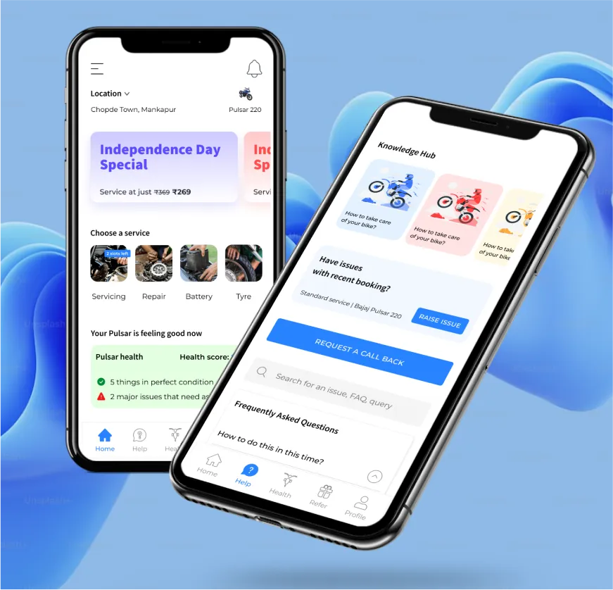
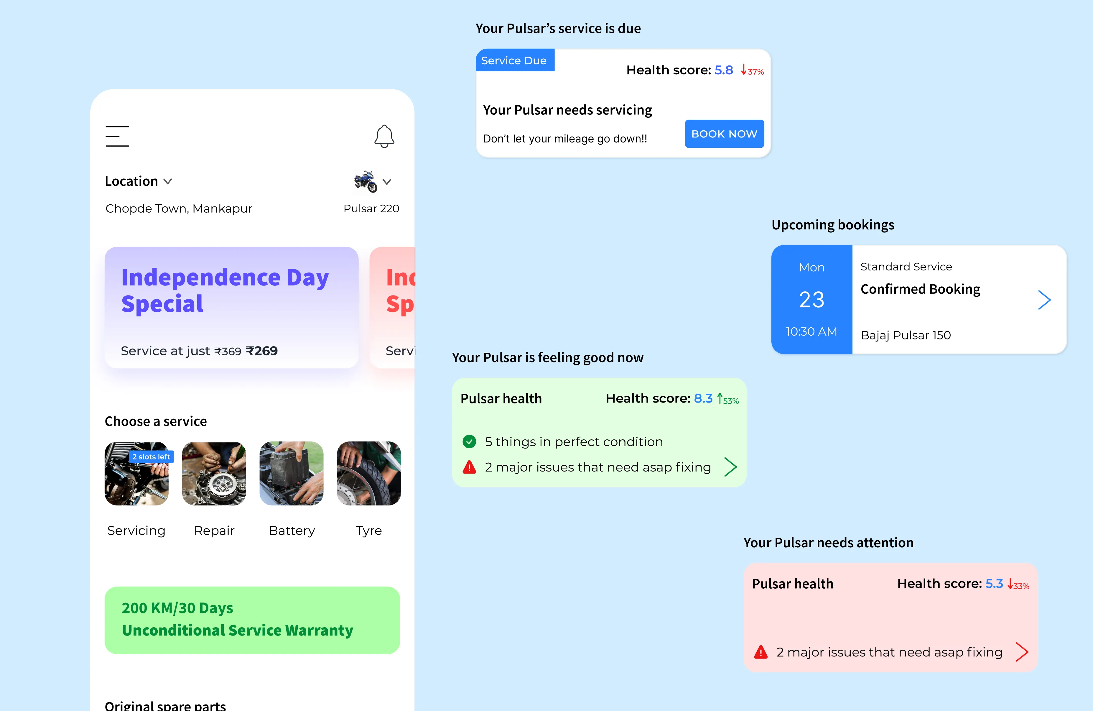
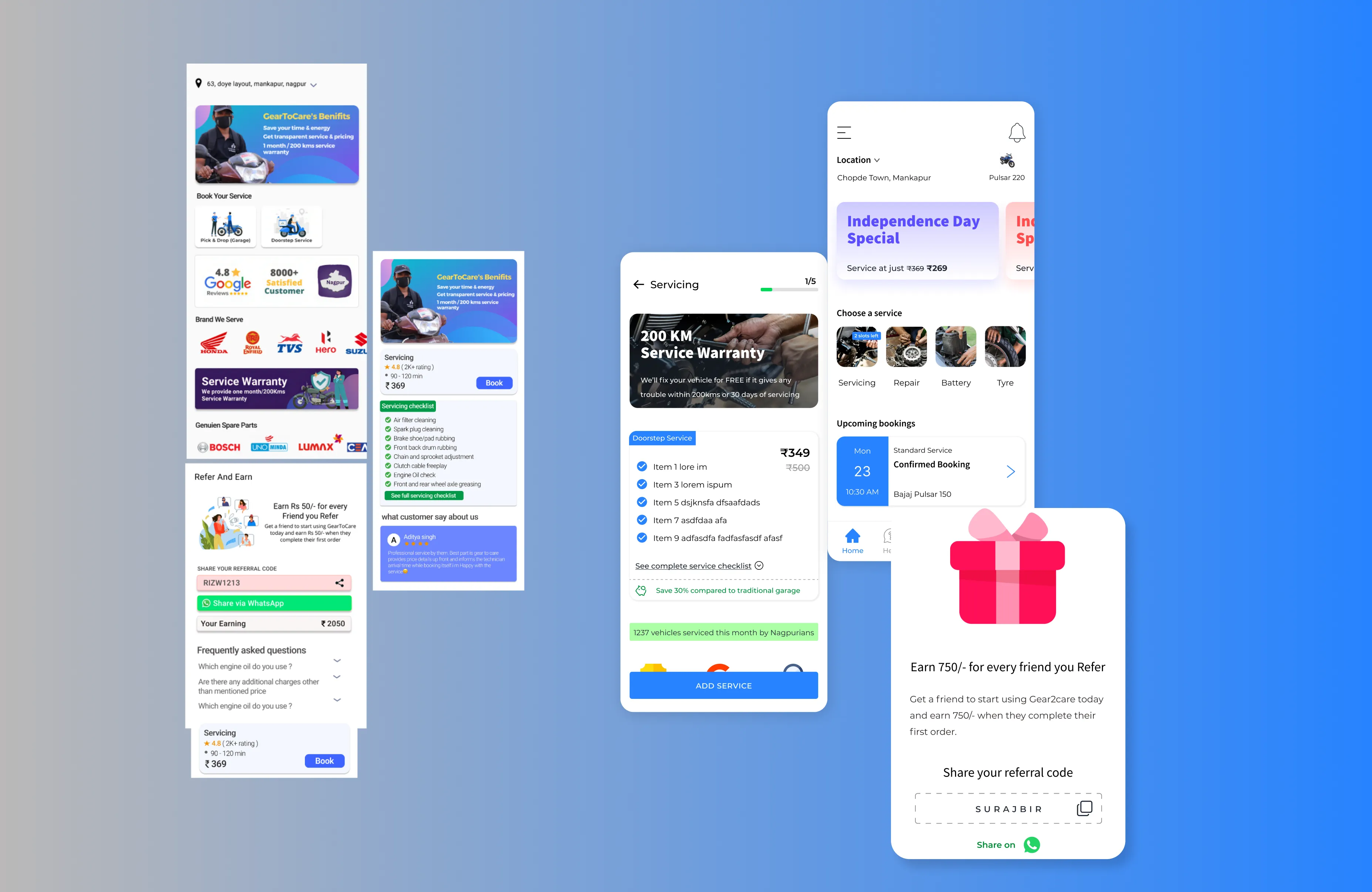
3. Contextual Home Page
Instead of a static app, we built a contextual dashboard that updated per user stage:
Booking reminder if a service is scheduled
Quote status if a repair is requested
Health card history and support buttons post-service
This made the app useful beyond just booking.
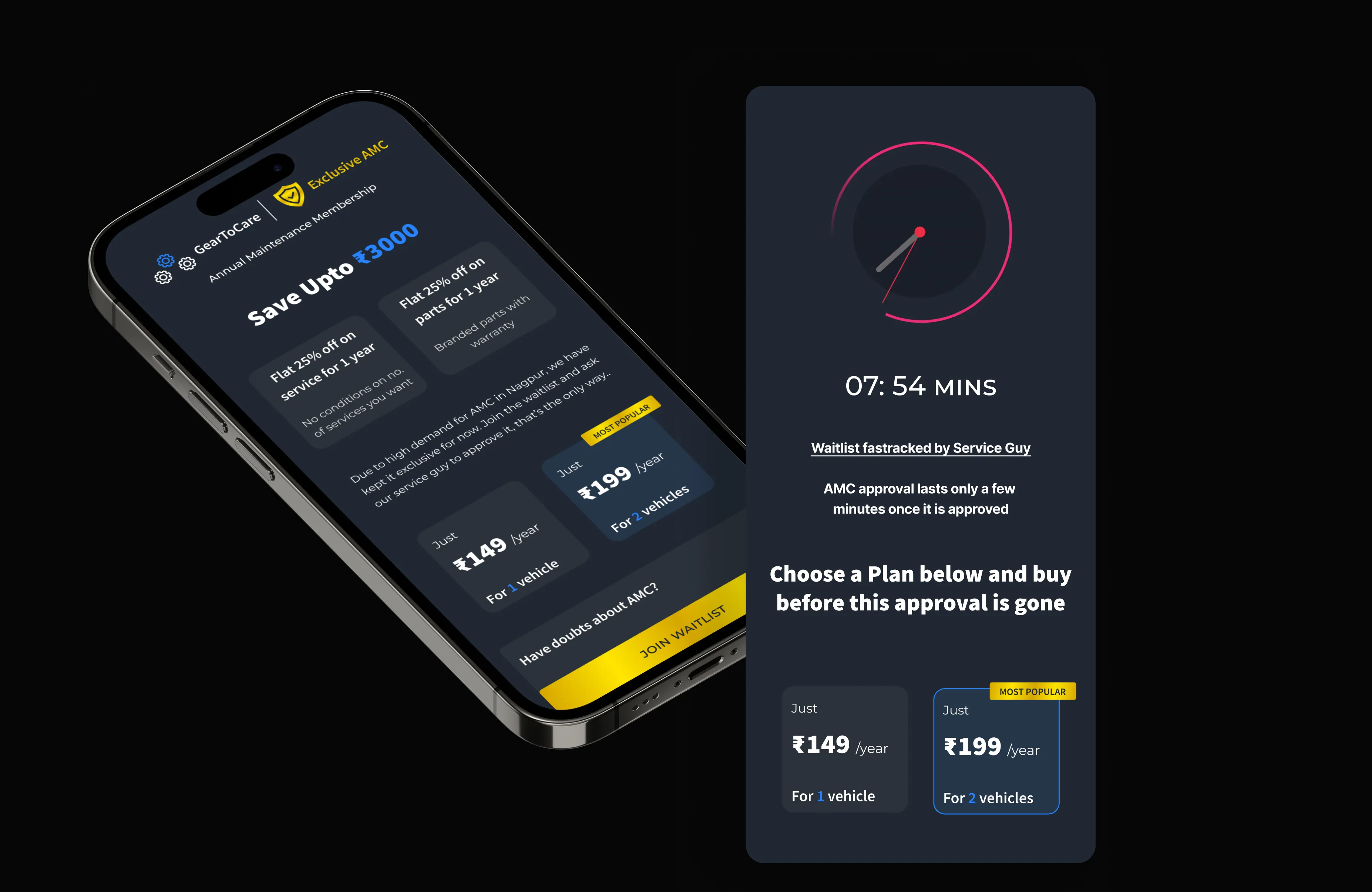
4. Membership FOMO Flow (AMC Conversion)
To boost AMC memberships, I designed a 10-minute invite-only offer embedded post-service. Mechanics handed a code with benefits explained and a timer began ticking inside the app, exclusive access to discounted AMC for 10 minutes only.
This urgency + exclusivity model (co-created with the marketing team) led to an 11% boost in AMC signups.
5. Upsell Add-Ons
We used context-based suggestions like:
Monsoon? → Brake pad, tyre inspection
Summer? → Engine oil + coolant package
These appeared during checkout based on season and location. Combined with the health card triggers, this increased average order value without overwhelming users.
simple component library & visual identity
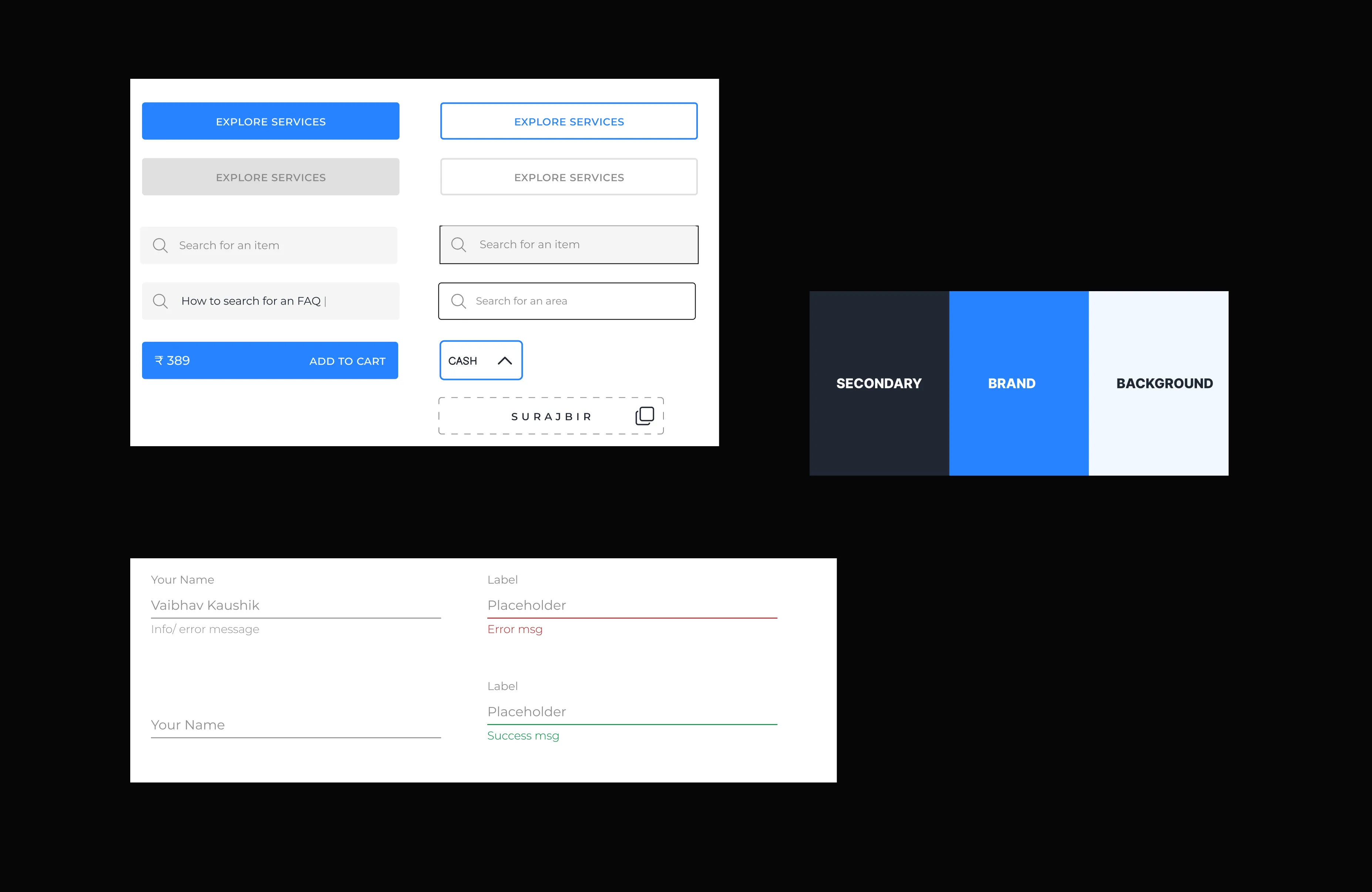
Used a warm blue + yellow color system to signify reliability and energy
Designed for accessibility with WCAG AA contrast and 44px+ touch targets
Built a lean component library in Figma for cards, badges, sliders, and tracker states
Used icons + text for all statuses (to aid colorblind users)
Created modular variants for easy dev handoff and real-world scalability
ui revamp
We tested 3 home screen concepts:
Static info page
Tab-based nav
Dynamic dashboard → Winner
A/B tests showed:
18% faster repeat bookings via contextual reminders
Lower drop-offs post-booking due to live service status integration
We iterated weekly with feedback from the founder, mechanics, and customers in parallel.
collaboration & constraints
Developer Syncs: Designed for low bandwidth areas, optimized media compression and asynchronous updates.
Mechanic Flow Mapping: Interviewed 4 mechanics to map what updates they could realistically log.
PM Tradeoffs: Postponed wallet integration in favor of live updates for launch.
Regular Loom updates, async Figma comments, and Notion documentation helped us stay agile and lean.
outcome
reflection
This case proved that even low-trust service categories can be reimagined with thoughtful UX and behavioral design.
Key Learnings:
Service design = Trust design
Transparency creates upsell opportunities, if framed with empathy
Mechanics are users too. Designing around their workflows creates better customer experiences.
accessibility & inclusion
Color contrast, touch targets, and copy readability met WCAG AA
Status icons had paired text for colorblind accessibility
Health card used familiar metaphors to ensure readability for low-literacy users