Mobile app, Website, Admin panel
India's first goal based P2P investment app
UI design
UX design
Product management
UX research
35
Lacs in investment within one month of launch (in lakhs)
4.5
Playstore rating
overview
Client: Growlex Fintech
Role: Lead Product Designer
Timeline: 3 months
Platform: Mobile (iOS & Android)
Team: 1 Founder, Me (Designer), 1 PM, 2 Engineers
Growlex set out to simplify wealth-building for India’s young working population through a new class of RBI-regulated, P2P lending-based investment instruments. The challenge? Build a zero-to-one investment product that made an unfamiliar financial model feel as intuitive and safe as a savings jar.
highlights
Single handedly designed and managed all the products, website and admin panel. Collaborated with developers to bring design to life.
deliverables
Mobile app design
Website design
Product management
Admin panel & Component library
business & design goals
Business Objectives
Build and launch an MVP mobile app within 3 months
Onboard 1,000+ early adopters with a goal-based investment approach
Enable ₹25L+ in transactions within the first 30 days
Gather user data to drive 2nd round of funding
Design Objectives
Build trust in P2P lending for new-to-investment users
Design a simple goal-driven flow for first-time investors
Create a visual language that balances security, clarity, and growth motivation
discovery & research
Approach
I started with a rapid research sprint to understand our target users and the perception gap around P2P lending. I conducted:
10 user interviews across Tier 1 & Tier 2 cities
3 stakeholder workshops to map feature priorities
A competitive audit across fintechs like Groww, Jar, and Cred
Key Insights
Low Trust in Non-Banking Products
Most users equated "P2P investment" with risky or scammy products. Trust symbols, RBI mentions, and transparency were non-negotiable.High Savings Behavior, Low Investing Behavior
Users were disciplined savers but avoided “investment” due to complex language or uncertain returns. They saved toward goals—phones, trips, weddings.Simplicity > Control
Users didn’t want advanced features like filters or return optimizers. They preferred a wizard-like guidance model, investing in <3 steps.
How might we simplify P2P investment into a goal-based habit while building deep user trust in a market full of skepticism?
This question guided every design decision—ensuring the experience removed cognitive friction, reduced ambiguity, and built confidence at every step.
design process
UX Strategy
I split the experience into four product pillars:
Goal-Driven Onboarding
Rather than choosing an investment product, users picked a goal first (e.g., “Buy a MacBook”). This helped anchor financial action to emotion.Progressive Disclosure
We simplified investment concepts behind layered screens. Risk levels became “Lender Score,” return ranges were shown post-commitment.Trust Layer
Every high-friction screen had contextual reassurance: secure payment gateways, RBI registration, partner lender transparency, and FAQs.Gamified Rewards
We introduced milestones, cashback for first-time deposits, and small nudges to continue investing (like “You’re ₹500 away from your MacBook”).
Iteration & Testing
Wireframes & click-through prototypes were built in Figma and tested with early beta users via WhatsApp.
Weekly feedback loops drove iteration, especially for onboarding friction and risk clarity.
We pivoted mid-way from a complex “compare & invest” model to a guided flow with just 3 core screens.
Accessibility reviews ensured color contrast, readable fonts, and tappable areas met baseline standards.
visual language & design system
We built a lean component system based on:
4pt spacing grid for scalable layout
Primary blue + trust green palette to evoke security and growth
Custom iconography to visualize abstract financial concepts
Microcopy and tooltips to handle edge cases or questions on the spot
To ensure fast developer handoff, all components were structured in Figma using variants and autolayout. I also documented transitions, skeleton loaders, and empty states to ensure product completeness.
key flows
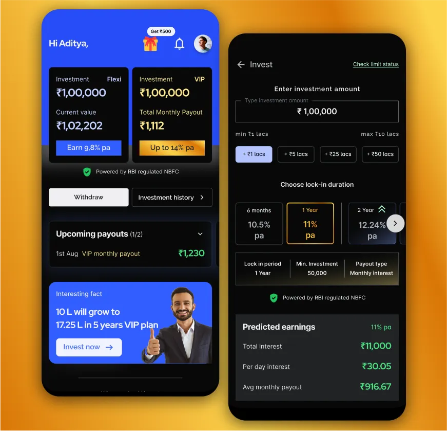
Goal Selection Flow
Users chose a predefined goal or created a custom one. The tone was playful and positive—emphasizing achievement over financial complexity.Investment & Return Visualization
After goal setup, users were guided through selecting an amount, tenure, and projected return. Complex terms were hidden unless toggled.Transaction History & Trust Section
We added dedicated screens to track investments, returns, and FAQs on partner vetting, terms, and RBI regulation—all linked with contextual tooltips.
outcomes
₹35L+ invested in 30 days after launch
4.5★ Play Store rating with 200+ organic signups
12% drop in onboarding friction after usability fixes
Triggered 2nd round of VC conversations based on MVP traction
We also saw repeat investment behavior from 40% of early users—a sign that habit formation had kicked in.
collaboration
This was a cross-functional sprint. I collaborated closely with:
The PM on backlog prioritization and MVP scoping
The Founder for risk communication strategy
Developers for implementing UI logic, error states, and edge cases
Our legal advisor for RBI-compliance text placement and copy reviews
Weekly standups and async Loom updates helped us stay on track despite being a lean team.
reflection & learnings
This project was a crash course in designing for trust. I learned that:
Users don’t want control—they want clarity.
Trust isn’t built by telling, but by showing and guiding.
MVPs work best when every feature is rooted in a clear problem-to-solution arc.
I also learned how to:
Make decisions quickly in ambiguous environments
Use behavioral triggers to simplify financial UX
Lead low-code usability testing cycles on tight timelines
accessibility & inclusive design
Designing for accessibility was a priority from the early stages. We ensured:
All UI components passed WCAG AA standards for contrast and typography
Tap targets followed a 44px minimum rule to support motor impairments
Icons were paired with text labels for users with low vision
We designed for colorblind safety using pattern overlays and not relying solely on color
While the MVP didn’t support screen readers yet, I documented ARIA labels and navigation structure for V1.1
Inclusive design goes beyond compliance—so we also ran copy tests with non-finance users to ensure investment terms were understandable at an 8th-grade reading level.
ux flow evolution & key screens
We designed Growlex with a focus on progressive guidance and reduced cognitive load. The initial flow included optional filters and plan comparisons, but early usability tests showed users felt overwhelmed.
Iteration Snapshot:
V1: Complex card-style plans, return sliders, too much choice
V2: Simplified 3-step goal wizard → investment amount → review
Result: +12% improvement in onboarding completion
We validated this flow through 5 rounds of prototyping and iteration. User feedback consistently showed preference for “guided clarity” over control.
“I didn’t want to figure it out—I just wanted to trust the app.” — beta user
want the full prototype or design system?
→ [Request access to the interactive prototype]
→ [View design system structure in Figma]

Let’s build something worth bragging about !
contact